What you'll learn
- What semantic HTML gives assistive technology that a div cannot
- How screen reader users actually move through a page
- The right elements for landmarks, headings, buttons, links, forms and images
- When ARIA helps, when it hurts, and how to manage focus in a React app
- How to test accessibility with linters, tests, browser tools and your own keyboard
Accessibility, often shortened to a11y (11 letters between the "a" and the "y"), is about making sure people can use what you build no matter how they use the web. Some of your users read the page with a screen reader. Some never touch a mouse and move with the keyboard or a switch device. Some control their computer by voice, zoom the page to 200%, or simply find a cluttered interface hard to follow.
The good news for React developers is that most of the work is not special accessibility code. It is choosing the right HTML element. A button is focusable, works with the keyboard and tells a screen reader it is a button, for free. A div with an onClick does none of that.
The same choices help everyone else too. Search engines read your structure to understand the page, and teammates can tell what a block of JSX is for at a glance.
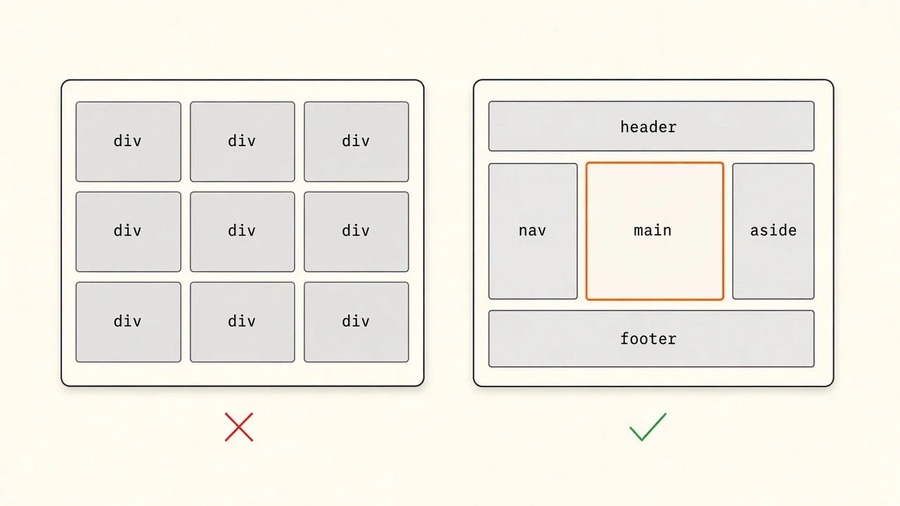
What semantic HTML actually gives you
Semantic HTML means using elements for what they mean, not for how they look. nav means navigation, h2 means a section heading, button means an action.
The browser turns your HTML into two trees. The DOM is what you style and script. The accessibility tree is a simplified version that assistive technology reads. For each element, it holds three things:
- Role: what the element is, such as button, link, heading or navigation.
- Name: what it is called, usually its text, its
labelor itsalt. - State: extra details such as checked, expanded, disabled or the heading level.
Semantic elements fill in all three automatically. A div has the role "generic", which tells assistive technology nothing.
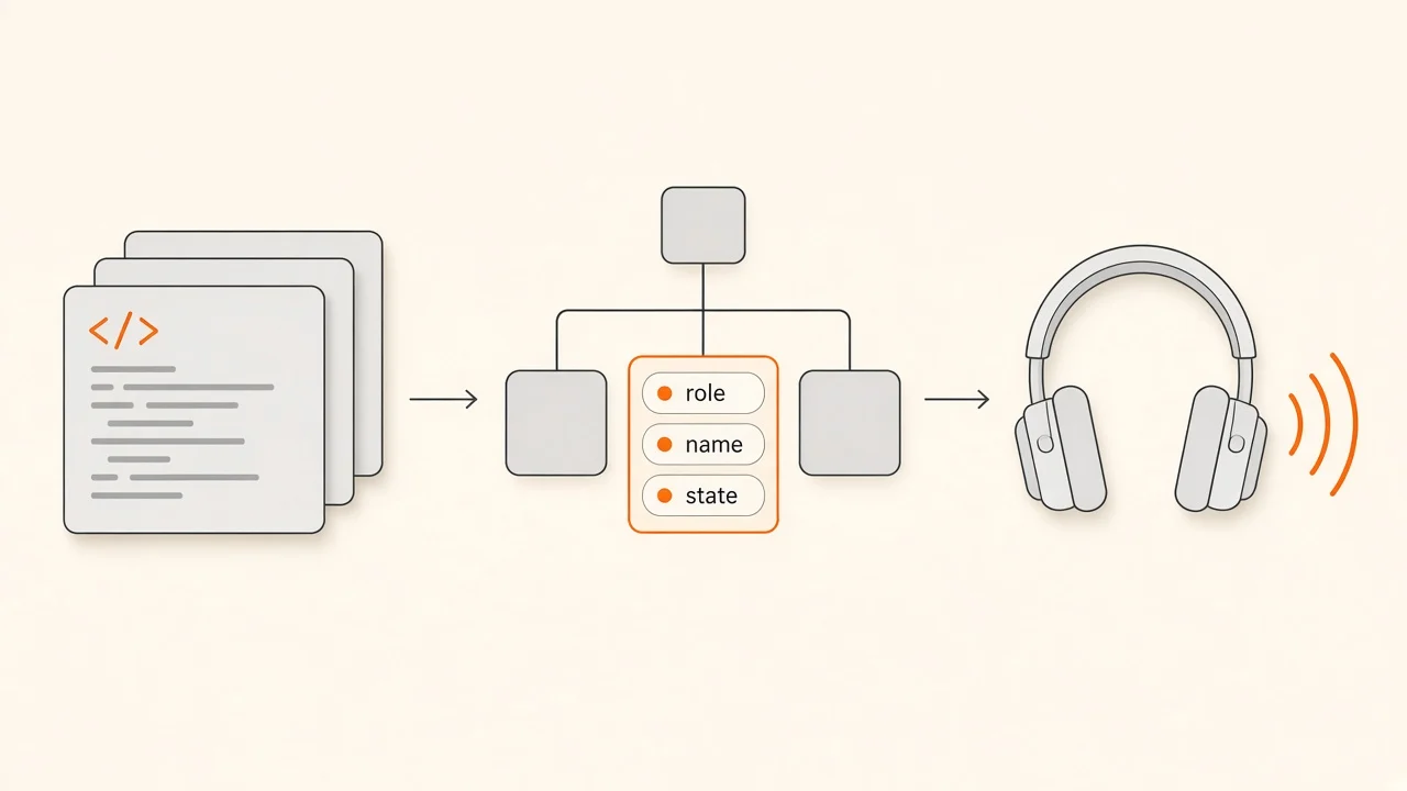
You can see this tree yourself. In Chrome DevTools, open the Elements panel and select the Accessibility tab next to Styles.
Checkpoint
What does a screen reader learn about <div onClick={save}>Save</div>?
Pick an answer, or press A, B, C on your keyboard.
How assistive technology reads a page
Sighted users scan a page in a second: logo at the top, menu on the left, the main heading, the form. Screen reader users get the page one item at a time, so they skim with shortcuts instead. The most common ones jump to the next landmark, the next heading, the next link or the next form control. Tab moves between interactive elements, exactly as it does for keyboard users.
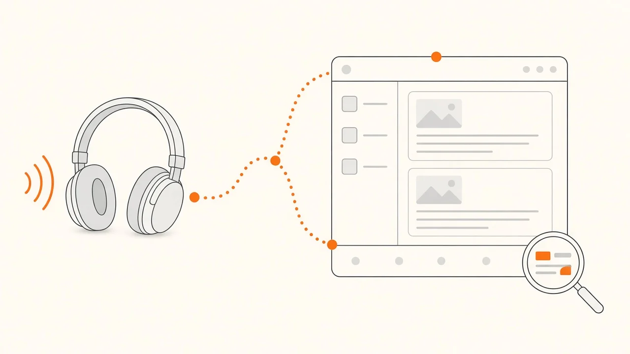
Those shortcuts only work if the page has landmarks and headings to jump to. Try it below. Start with "Div soup", press "Next landmark" and "Next heading", then Tab to the Create account button. Then switch to "Semantic HTML" and do the same.
Try it: screen reader simulator
The page below looks the same either way. Navigate it the way a screen reader user would, first built from divs, then from semantic elements, and compare what you hear.
What sighted users see
Markup under the cursor
Press a key below to start reading.
Screen reader says (newest first)
- Nothing yet. Try “Next landmark”.
Announcements are simplified. Real screen readers such as NVDA, JAWS and VoiceOver word things slightly differently, and the shortcut keys depend on the screen reader.
Key takeaway
A screen reader can only skip to structure that exists in the markup. Div soup forces users to listen to the page from top to bottom, and a div button is never reached with Tab at all.
Landmarks and headings
Landmarks are the big regions of a page. Each one maps to an HTML element:
| Element | Landmark role | Use it for |
|---|---|---|
header (top level) | banner | Site logo and global header |
nav | navigation | Groups of navigation links |
main | main | The main content, once per page |
aside | complementary | Related content beside the main content |
footer (top level) | contentinfo | Site footer |
form with a name | form | A form you want users to find quickly |
If you have more than one nav, give each one a name with aria-label (for example "Main menu" and "Footer links") so users can tell them apart.
Headings are the table of contents of your page. A few rules keep them useful:
- Use one
h1that says what the page is about. - Do not skip levels. An
h4straight after anh2makes users wonder what they missed. - Pick the level for the structure, not the font size. If an
h3needs to look small, style it with CSS.
In a component library, this often means letting the caller choose the heading level, because the same Card can sit under an h2 on one page and an h3 on another.
Fragments over wrapper divs
A component that returns two siblings does not need a wrapper div. Use a Fragment (<>...</>) instead. Extra divs are harmless on their own, but they break HTML that depends on parent and child elements. A div between a ul and its li items, or between a table and its rows, can stop a screen reader from announcing "list, 5 items" or reading a table as a table.
Buttons, links and the div onClick trap
The rule is short:
- If it goes somewhere (changes the URL), use a link:
<a href>or your router'sLink. - If it does something on the current page, use a
button.
A clickable div looks like a button but loses everything that makes a button usable. It is not in the Tab order, Enter and Space do nothing, a screen reader does not announce it as a button, and it ignores disabled.
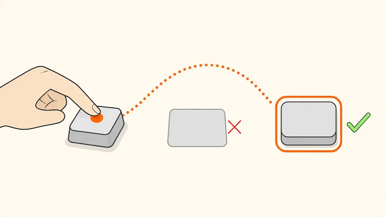
The left side is what it takes to patch a div properly, and it is still missing disabled support and form submission. The right side does all of it in one line. Reset the button's default styles with CSS if they get in the way.
Two related traps:
<a onClick={...}>without anhrefis not focusable and is not announced as a link. If it does an action, make it abutton.<button onClick={() => router.push('/settings')}>navigates, but users lose "open in new tab", middle-click and link previews. Use a link for navigation.
Predict the output
A keyboard user loads this page and presses Tab three times. Where does focus go?
<a href="/pricing">Pricing</a>
<div className="btn" onClick={save}>Save</div>
<button type="button" onClick={cancel}>Cancel</button>Pick an answer, or press A, B, C, D on your keyboard.
Forms that explain themselves
Every input needs a name a screen reader can announce. The most reliable way is a real label connected to the input. In React the attribute is htmlFor, and useId gives you a unique id that is stable between the server and the client:
import { useId } from 'react'

function EmailField({ error }: { error?: string }) {
  const id = useId()
  const errorId = `${id}-error`

  return (
    <div>
      <label htmlFor={id}>Email</label>
      <input
        id={id}
        type="email"
        autoComplete="email"
        aria-invalid={error ? true : undefined}
        aria-describedby={error ? errorId : undefined}
      />
      {error ? <p id={errorId}>{error}</p> : null}
    </div>
  )
}
What each piece does:
label htmlForgives the input its name, and clicking the label focuses the input.aria-invalidtells assistive technology the value was rejected.aria-describedbypoints at the error text, so it is read when the user reaches the field, not only shown in red.autoCompletelets browsers and password managers fill the field, which helps people with motor and memory difficulties.
A placeholder is not a label. It disappears as soon as the user types, it is usually low contrast, and not every screen reader announces it.
Group related controls, such as a set of radio buttons, with fieldset and legend, so the question is read along with each option:
<fieldset>
  <legend>Billing period</legend>
  <label><input type="radio" name="period" value="monthly" /> Monthly</label>
  <label><input type="radio" name="period" value="yearly" /> Yearly</label>
</fieldset>
Images and icons
Every img needs an alt attribute. What goes in it depends on why the image is there:
- Informative images: describe what the image tells the reader, in the context of the page. "Bar chart: sign-ups doubled in March" is more useful than "chart".
- Decorative images: use an empty
alt="". The screen reader skips it. Leavingaltout entirely is different: some screen readers then read the file name instead. - Images inside links or buttons: describe the destination or the action, not the picture. A logo that links home can use
alt="Acme home". - Complex images such as charts and diagrams: give a short
altand put the details in the surrounding text or a caption.
Next.js makes alt a required prop on next/image, so a missing one shows up during development.
Icon-only buttons need a name too, because the icon itself says nothing to a screen reader:
<button type="button" aria-label="Close dialog" onClick={onClose}>
  <XIcon aria-hidden="true" />
</button>
aria-hidden="true" on the SVG stops screen readers from trying to read the icon's internal shapes or title.
ARIA: use it sparingly
ARIA (Accessible Rich Internet Applications) is a set of attributes that change what the accessibility tree says about an element. It is powerful, and that is exactly why it is risky. The ARIA Authoring Practices Guide puts it plainly: no ARIA is better than bad ARIA. ARIA changes what assistive technology announces, but it adds no behavior. A role="button" is a promise that you also made it focusable and handled the keyboard.
So reach for a native element first. Use ARIA for what HTML cannot express on its own:
// A disclosure: tell users whether the panel is open
const [open, setOpen] = useState(false)
const panelId = useId()

<button type="button" aria-expanded={open} aria-controls={panelId} onClick={() => setOpen(!open)}>
  Filters
</button>
<div id={panelId} hidden={!open}>...</div>

// The current page in a navigation menu
<a href="/pricing" aria-current="page">Pricing</a>

// A status message, read out without moving focus
<p role="status">{saved ? 'Changes saved' : ''}</p>
A role="status" element is a polite live region: when its text changes, the screen reader reads the new text once it finishes what it was saying. Render the element up front and change its content. A live region that appears together with its message is often not announced.
For complex widgets such as comboboxes, tabs, menus and date pickers, the correct keyboard behavior is long and easy to get wrong. Use a headless library that follows the APG patterns (opens in a new tab), such as React Aria, Radix UI, Headless UI or Ariakit. The Ecosystem page lists more.
Checkpoint
A teammate's PR has a div with onClick acting as a button. What is the best review comment?
Pick an answer, or press A, B, C on your keyboard.
Focus in React apps
Focus is where keyboard input goes. In a server-rendered site, every navigation loads a new page, focus starts at the top and the screen reader announces the new title. Single page apps change the content without a page load, so you have to handle a few things yourself.
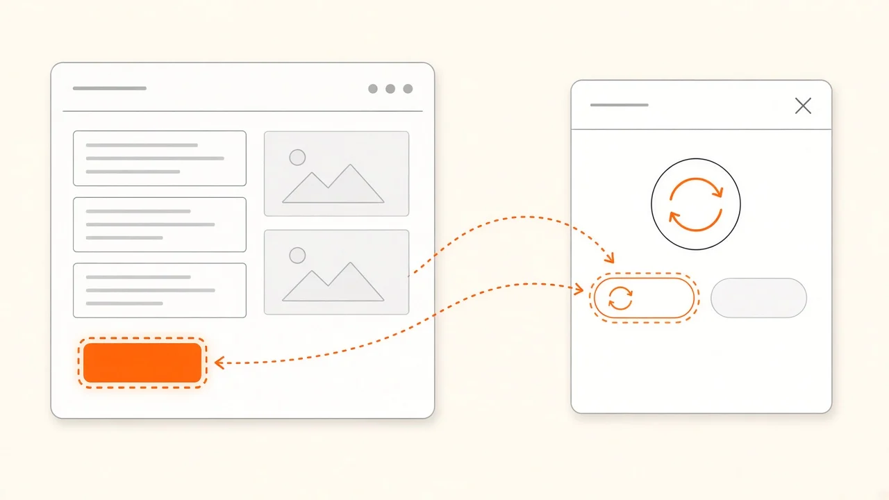
Route changes. Next.js has a built-in route announcer that reads the new page title after client-side navigation. Other routers may not. A common pattern is to move focus to the new page's h1 after navigation, giving the heading tabIndex={-1} so it can receive focus from code without joining the Tab order.
Dialogs. The native dialog element does most of the hard work. When you open it with showModal(), the rest of the page becomes inert, so focus cannot wander behind it, and Escape closes it:
function ConfirmDialog({ open, onClose }: { open: boolean; onClose: () => void }) {
  const ref = useRef<HTMLDialogElement>(null)

  useEffect(() => {
    const dialog = ref.current
    if (!dialog) return
    if (open && !dialog.open) dialog.showModal()
    if (!open && dialog.open) dialog.close()
  }, [open])

  return (
    <dialog ref={ref} onClose={onClose} aria-labelledby="confirm-title">
      <h2 id="confirm-title">Delete this project?</h2>
      <button type="button" onClick={onClose}>Cancel</button>
    </dialog>
  )
}
When a dialog closes, focus should go back to the button that opened it, so the user does not land at the top of the page. Check this in the browsers you support, and if you build a custom modal instead of using dialog, store the opener and focus it again yourself.
Visible focus. Never remove focus outlines without a replacement. :focus-visible shows the ring for keyboard users without showing it on every mouse click:
:focus-visible {
  outline: 2px solid #ff5600;
  outline-offset: 2px;
}
Testing accessibility
No single tool covers accessibility. Combine fast automated checks with a short manual pass.
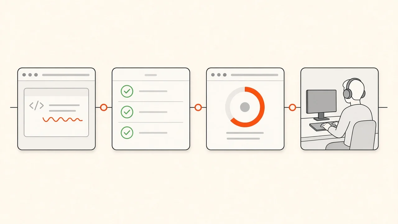
Lint while you type. eslint-plugin-jsx-a11y flags missing alt text, invalid ARIA, clickable divs and more. eslint-config-next only turns on a handful of its rules, as warnings, so add the recommended set for full coverage:
// eslint.config.mjs
import jsxA11y from 'eslint-plugin-jsx-a11y'

export default [
  jsxA11y.flatConfigs.recommended,
  // ...the rest of your config
]
Query by role in tests. Testing Library's getByRole finds elements the way assistive technology does. If the "button" is a div, this test fails, which makes every component test a small accessibility check. Automated Testing covers the setup.
await user.click(screen.getByRole('button', { name: 'Create account' }))
expect(screen.getByRole('status')).toHaveTextContent('Check your email')
Run axe. jest-axe runs the axe-core rules against a rendered component:
import { axe, toHaveNoViolations } from 'jest-axe'

expect.extend(toHaveNoViolations)

test('signup form has no detectable a11y violations', async () => {
  const { container } = render(<SignupForm />)
  expect(await axe(container)).toHaveNoViolations()
})
In the browser, the axe DevTools extension and the Lighthouse accessibility audit check a whole page.
Test by hand. Automated tools cannot tell whether your alt text makes sense, whether the focus order is logical or whether a custom widget is usable. Before you ship a new screen:
- Put the mouse away. Use Tab, Shift+Tab, Enter, Space, Escape and the arrow keys. Can you reach and use everything, and can you always see where focus is?
- Turn on a screen reader for five minutes: VoiceOver on macOS (Cmd+F5) or NVDA on Windows, which is free. Jump through the headings and landmarks and fill in a form.
- Zoom the page to 200% and check that nothing is cut off or overlapping.
Make it part of how you build
Accessibility does not work as a task you add right before launch. By then the decisions that matter, like which elements a component renders or how a dialog handles focus, are built into dozens of places, and late fixes tend to be patches that cause new problems.
It works much better as a habit:
- Build accessible versions of your shared components once, such as buttons, inputs, dialogs and menus, and everyone gets them for free.
- In code review, look at the elements in new JSX. A
divwithonClickor an input without a label is as much a bug as a missing null check. - Keep a short checklist, like the one below, in your pull request template.
- Have each developer try a screen reader once. It changes how people write markup more than any guideline.
Accessibility checklist
- The page has
header,nav,mainandfooterlandmarks, and onemain. - There is one
h1, and heading levels do not skip. - Actions use
button, navigation uses links with anhref. - Every input has a connected
label, and errors are linked witharia-describedby. - Every
imghas analt, empty for decorative images. - Icon-only buttons have an
aria-label. - ARIA is only used where HTML has no native option.
- Dialogs trap focus, close with Escape and return focus to their opener.
- Focus is always visible.
- jsx-a11y lint rules and an axe check run in CI.
- The page works with only a keyboard.
Further reading
- HTML: A good basis for accessibility (opens in a new tab) on MDN
- HTML elements reference (opens in a new tab) on MDN
- ARIA and HTML (opens in a new tab) on web.dev
- ARIA Authoring Practices Guide: Read Me First (opens in a new tab)
- WCAG 2.2 quick reference (opens in a new tab)
- Accessibility cheat sheet (opens in a new tab)
- Ten blunt things I wish I could tell clients (opens in a new tab) by Karl Groves, accessibility consultant
Conclusion
Most accessibility problems in React apps come from a small set of habits: divs where elements should be, inputs without labels, images without alt text, and focus that gets lost. Each one has a simple fix, and most of the fixes are plain HTML.
Start with the elements. Use ARIA only to fill the gaps HTML leaves, manage focus when the page changes without a reload, and test with your keyboard as well as your tools.
The key takeaway
Choose the element that matches what the thing is. The browser then gives you focus, keyboard support and a correct description for assistive technology, without extra code.
Check your understanding
What does the accessibility tree hold for <button>Save</button>?
Pick an answer, or press A, B, C on your keyboard.
Recap
What to remember from this article
Sections read
0
Questions
0
none answered yet
Quiz
0
not taken yet
Up next: Styling & UI Libraries · 4 min
Continue